Here is a nice chance to practice on logarithms, addressed in particular to my high-school students, currently kept home, here in Milan, by our temporary health emergency.
Viruses, at first, tend to spread exponentially, because there is no immunization. That is why it is better to analyze and graphically plot the number of confirmed cases on a logarithmic scale, which allows to simultaneously visualize values that change over large intervals.
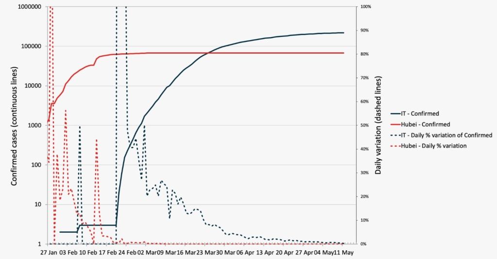
The graph below (last update may 11th 2020) shows some Coronavirus (Covid-19) data for both Italy and Hubei province in China, where the first cases where reported, and whose population size is comparable with the italian one. You can download yourself the data here.
In dashed lines you see the daily percentage change (linear scale axis on the right), and in continous lines the total number of confirmed cases (logarithmic scale axis on the left). Note that once the virus stops spreading, the logarithmic line tends to become horizontal. Based on the graph, and ignoring other factors that may arise and make the analyisis more difficult, how do you think the desease will evolve in Italy? How much time do you think it will take the virus to stop spreading?
Come back to this page in the next few days to see the updated graph and check if your guess was correct or if it needs to be updated.
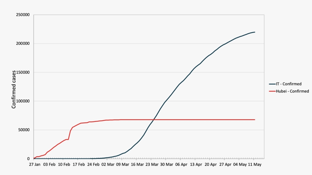
For completeness, and for a proper comparison with the above graph, check out how the same data (number of confirmed cases) looks like on a linear scale.